
A surprising thing happens when a good still image meets the right motion workflow: the image stops behaving like a finished asset and starts behaving like a flexible production resource. That is the first reason Image to Video AI held my attention. In many creative systems, a still image marks the end of one process. Here, it looks more like the beginning of another. In my testing, that shift felt more useful than flashy promises about AI video replacing everything else.
Most teams already have images. They have product shots, campaign visuals, concept art, portraits, event photos, or educational graphics. What they usually do not have is the time to turn every one of those assets into custom video. Traditional editing workflows can solve that problem, but they ask for more software, more labor, and more patience. A browser-based photo-to-video workflow changes the economics of motion by treating existing images as material that can keep working after the design stage ends.
That is why I think the most interesting way to test this page is not to ask whether it can imitate a full production studio. The more revealing question is whether it can extend the useful life of finished visuals. If the answer is yes, then the tool is not merely generating movement. It is increasing the return on visual assets that have already cost time, money, or attention to create.
That is exactly where Photo to Video becomes more than a simple conversion page. It becomes a practical bridge between image creation and image distribution, especially for users who need more output without reopening an entire production cycle. In that sense, the real story is not animation alone. The real story is asset reuse made more creative and more immediate.
Why Asset Reuse Is A Better Testing Lens
A lot of AI reviews become shallow because they test everything as entertainment first. They ask whether the result looks cool, whether the movement feels dramatic, or whether the demo resembles a movie trailer. That can be fun, but it often misses the everyday value of a tool.
Most workflows begin with something already approved
In real teams, the starting point is usually not imagination without limits. It is a visual that has already been selected, refined, and approved. The product image is final. The marketing visual is locked. The event photo already exists. The educational illustration is ready. At that point, the bottleneck is not design. It is motion.
That is why photo-to-video matters. It gives those existing images a second life without requiring the whole creative team to start over.
The landing page supports this practical reading
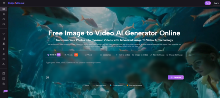
The public interface does not present an abstract creative philosophy. It presents a compact workflow. You can upload an image, write a prompt, choose practical settings, and generate a result. The page also shows aspect ratio, video length, resolution, frame rate, seed, and visibility. That visible structure makes the product feel like a production utility rather than a vague experimental playground.
Utility often matters more than ambition
There are many powerful tools in AI video, but powerful tools are not always the ones that get used most often. In my observation, the tools that win regular use are the ones that make ordinary tasks easier. Turning a finished image into a short moving asset is exactly that kind of task.
The best workflow is usually the one people repeat
A beautiful one-time generation is nice. A workflow people are willing to repeat every week is far more valuable. This landing page seems designed with that repeatability in mind, which is one reason it feels commercially sharper than many broader AI video experiences.
What The Official Workflow Actually Suggests
The visible process on the page is short enough to understand quickly and structured enough to feel credible. Based on what the page publicly shows, the workflow can be reduced to three steps.
Step 1: Upload the image you already trust
The page supports common file formats such as JPG, JPEG, PNG, and WebP. That matters because it removes friction at the beginning. Users do not need an unusual format or a special preparation stage. They can start from the same images they already use elsewhere.
Step 2: Describe the kind of motion you want
The next stage is prompt-based. Rather than keyframing every action manually, the user explains the intended motion or visual direction in natural language. This is where the workflow becomes more than a slideshow generator. The user is shaping how the still image should behave, not simply attaching a template.
Step 3: Generate and export the result
After processing, the video can be reviewed, downloaded, and used. The page openly frames the output as something suitable for social media, product showcases, event recaps, and tutorial-style content. That use-case clarity is important because it shows the product is oriented toward publication, not only experimentation.
What I Noticed About The Interface Design
A product often reveals its priorities before a single generation is tested. This page says a lot about itself through what it chooses to make visible.
The settings are practical rather than theatrical
There is a difference between a settings panel that exists to impress and one that exists to guide output. Here, the available controls feel closely tied to real publishing decisions. Aspect ratio matters because different channels reward different shapes. Resolution matters because quality expectations vary by use case. Frame rate changes how smooth the result feels. Video length matters because short-form content has real attention constraints.
That is why the interface feels grounded. It is not drowning the user in creative mythology. It is asking sensible questions about output.
The page keeps the cognitive load low
One of the best things about the layout is that it is legible. The process does not feel hidden. The controls do not feel buried. A user can understand the path from image to result without studying documentation first. That simplicity is not trivial. It affects whether people try a second generation or give up after the first.
The publishing mindset is visible everywhere
Even without using overly technical language, the page quietly signals an output-first mentality. The ratio choices, downloadable result, quality options, and public visibility setting all imply that the generated video is meant to leave the page and go into a larger communication system.
That makes the product easier to trust
In creative software, trust often comes from structure. When a page shows how output decisions connect to real publishing needs, the user feels less like they are experimenting blindly. In my testing mindset, this is one of the strongest aspects of the experience.
How Existing Images Gain More Strategic Value
The most interesting thing about photo-to-video is not that it adds motion. It is that it changes the value of still images inside a workflow.
One image can support more than one channel
A product photo might begin its life on a product page, then become a vertical motion asset for social media, then a short loop for an ad variation, then a supporting visual in a presentation. If a photo-to-video workflow makes those transitions easier, then the image itself becomes a more productive asset.
The page encourages a format-based mindset
Because the interface foregrounds ratio and length, it naturally encourages users to think about adaptation. The same image does not have to remain fixed in one context. It can be reinterpreted for different destinations. That flexibility is where a lot of the business value lives.
Repurposing can be more important than invention
There is a lot of excitement around generating entirely new content from nothing, but many teams need a less glamorous capability: they need existing material to work harder. In that environment, a good repurposing workflow can be more useful than a dramatic but unpredictable creation engine.
Where The Page Feels Especially Strong
The page is not trying to be everything, and that is part of why it works.
It understands a narrow but common problem
Many users are not asking for a cinematic universe. They are asking for a way to give motion to a still image they already like. This page seems very aware of that need.
It lowers the threshold for iteration
Because the process is browser-based and the workflow is compact, users can test several directions without feeling trapped in a long production cycle. That matters because generative tools usually become valuable through iteration, not through instant perfection.
It connects technology to recognizable use cases
Social posts, product showcases, recaps, tutorials, and similar outputs are easy to understand. They provide a clearer mental model for evaluation than vague claims about professional-grade creativity. I think this is one of the reasons the page feels more believable than many AI product pitches.
Believability is underrated
A tool does not have to sound revolutionary to become useful. Sometimes the best signal is that a user can immediately imagine where the result would go. This page performs well on that front.
What A Serious User Should Watch Carefully
A balanced test also needs to acknowledge the weak points.
The source image still sets a ceiling
If the original image is weak, confusing, or compositionally flat, motion will not solve everything. Better source material usually leads to better video results. That is not a flaw of this page alone. It is a structural truth of the category.
Prompt quality matters more than many beginners expect
A short text prompt is simpler than manual editing, but it still requires judgment. Users need to think about movement, pacing, subject emphasis, and the emotional feel of the clip. Vague prompts often produce vague outcomes.
Some projects will still need deeper post-production
This workflow is very useful for generation and fast asset extension, but not every job ends there. Some results may later need sequencing, captions, trimming, overlays, or editing elsewhere. That does not weaken the core value. It just clarifies the role.
My Main Takeaway From This Test
The strongest case for this page is not that it turns photos into videos. Many tools can say that. The stronger case is that it turns existing images into more deployable assets. That is a different and more interesting promise.
In my observation, the Photo to Video page works best when treated as an asset amplifier. It helps still images participate in more channels, more formats, and more moments of communication. For marketing teams, ecommerce operators, educators, and creators with large image libraries, that can be more valuable than a tool that aims for maximum cinematic drama but asks for much more time.
So the test left me with a fairly clear conclusion. The page succeeds not because it tries to replace every other creative workflow, but because it solves a common problem with unusual directness. It makes the still image feel unfinished in a productive way. And in a digital environment where attention often follows motion, that is a meaningful expansion of what a single image can do.


